



The colour chart is lying on the kitchen table, and the question is always the same: which colours in the child's bedroom help sleep, and which are more likely to keep your child awake in the evening? The wall colour is the largest surface in the room; it determines how bright the room feels in the evening, how calm it feels and how well the night light works in it. At the same time, plenty of claims are doing the rounds that are more marketing than knowledge: blue makes you sleepy, yellow makes you cheerful, pink calms girls. What actually matters is more sober and more helpful for parents: low stimulation, light reflection and the combination of wall, textiles and bed. In this guide we put colour psychology cautiously into perspective, show you in a table which tones suit which surface, and give you instructions for testing a colour scheme over a weekend.
The short answer: For restful sleep, muted, warm and light tones work best: sand beige, sage green, softened light blue, powder pink or a warm mist grey. They are low in stimulation, reflect enough light so that the room does not become gloomy, and dim well with a night light. Strong, saturated colours such as red, orange, hot pink or bright yellow belong on small surfaces, not on the wall. No colour replaces a calm evening ritual, however; it only supports it.
- Colour psychology offers tendencies, not guarantees: what matters is that the room feels low in stimulation in the evening.
- Light, muted tones reflect more light; a dark room needs more artificial light, which is disruptive in the evening.
- Keep large surfaces (walls, bed, floor) calm; bring colour in through cushions, pictures and rug.
- Warm white light of 2700 to 3000 kelvin makes muted colours look softer in the evening.
- Always test colour with large swatches on the wall, in the morning, at midday and under artificial light.
What colours really have to do with sleep
First, an honest assessment: there is no study showing that a child falls asleep faster in a green room than in a beige one. Colour psychology describes tendencies that depend heavily on culture, habit and personal experience. What sleep researchers and paediatricians do agree on, however, is the effect of the overall environment: a room with few stimuli, subdued light and a pleasant temperature makes it easier to wind down. Colour is one of those stimuli, and a big one, because the walls around the child fill most of their field of vision.
Three mechanisms are well founded. First, saturation: strong, saturated colours draw the eye, which is called activation; in the evening you want the opposite. Second, contrast: lots of patterns, stickers and colour changes create restlessness in the field of vision, even if each individual colour is calm. Third, association: children link colours to experiences; a tone reminiscent of forest, sand or wool feels familiar. If you bear these three points in mind, you do not need colour theory. Whether your child then actually falls asleep depends far more on the evening ritual and the daily routine; you will find the most common reasons for lying awake in the article My child won't fall asleep.
Light reflection: why light tones help in the evening
One aspect is almost always forgotten when choosing colour, even though it is measurable: how much light a colour reflects. Paint manufacturers state it as the light reflectance value. A pure white reflects roughly 85 to 90 per cent of light, a medium grey around 40 per cent, a dark anthracite or midnight blue often under 10 per cent. For the child's bedroom this means: the darker the wall, the more lamp light you need in the evening to find pyjamas, book and toothbrush, and the harsher the night light appears by contrast.
Light, muted tones with a light reflectance value of around 60 to 80 are therefore the best compromise. They spread the little light of a dimmed lamp throughout the room, the room feels soft rather than cave-like in the evening, and in the morning no ceiling light is needed. This is particularly important in rooms with north-facing windows or in ground-floor flats, as are common in many Swiss apartment buildings, and in winter, when it is dark at 5 pm. A south-facing room with plenty of daylight, on the other hand, can take a slightly richer tone. Dark feature walls are not forbidden, but they belong behind the head of the bed, where the child does not see them when lying down, and never opposite the window, where they swallow the daylight.
Colours in the child's bedroom: which ones help sleep?
The overview below summarises how individual colour families in muted form are usually perceived and what they are suited to in a child's bedroom. "Effect" here means the common perception, not a proven effect.
| Colour (muted) | Usual effect | Light reflection | Suitability in the child's bedroom |
|---|---|---|---|
| Sand beige, cream | Warm, secure, neutral | High | Ideal for all walls, timeless into school age |
| Sage green, light olive green | Calm, natural, grounding | Medium to high | Very good for walls and bed |
| Light blue, grey-blue | Cool, clear, spacious | Medium to high | Good in south-facing rooms; choose a warm tone in north-facing rooms |
| Powder pink, light mauve | Soft, warm, gentle | High | Good for walls and textiles, regardless of gender |
| Mist grey, greige | Calm, modern, unobtrusive | Medium | Good base, combine with warm textiles |
| Warm white | Airy, bright, neutral | Very high | Ideal in small or dark rooms |
| Mustard yellow, muted terracotta | Friendly, warm, invigorating | Medium | As a feature wall or textile, not all round |
| Anthracite, midnight blue | Cosy, cave-like | Low | Only behind the head of the bed or on the bed, not as a wall colour all round |
What stands out: almost all the suitable tones are light and desaturated. That is no coincidence, but the consequence of low stimulation and light reflection. Within this family you are free to choose; more important than the colour family is that you pick a muted variant.

Colours to avoid on large surfaces
This does not mean the child's bedroom has to be colourless. Strong colours have their place, just not on 30 square metres of wall around the bed. The 60-30-10 split has proved itself as a rule of thumb: 60 per cent of the room (walls, floor) in a calm base colour, 30 per cent (bed, large furniture, curtains) in a second, related colour, 10 per cent (cushions, pictures, toy boxes) for accents that are allowed to shine.
- Strong red and orange: Draw the eye strongly and are perceived as activating. Lovely as a cushion or picture frame, unsuitable as a wall colour in a sleeping space.
- Bright yellow: Looks cheerful in daylight, but under warm artificial light often looks harsh and greenish. Muted mustard or ochre yellow is the better alternative.
- Dark purple or black: Swallow light; the room looks dark in the evening and heavy during the day.
- Colourful wallpaper with motifs: Is highly stimulating and usually no longer age-appropriate after two years. A motif as a picture or sticker can be swapped; wallpaper cannot.
In small rooms this has an even stronger effect, because the walls are closer to the child; the article on the small child's bedroom shows how to reconcile colour and space there.
Get CHF 25 off
Subscribe to the newsletter and receive a one-time CHF 25 discount. ✓ 100-night trial ✓ 5-year warranty ✓ Free delivery
Myths under the fact check
"Blue makes you sleepy." Blue is considered calm, but the effect depends on the tone. A cold, light blue can make a north-facing room feel frosty in winter; a warm grey-blue, by contrast, feels calm. And crucially: blue light in the evening, from a tablet for instance, is a completely different matter from blue wall paint. The one demonstrably affects the body clock; the other does not.
"Pink is for girls, blue for boys." That is a twentieth-century fashion, not a rule of perception. Powder pink is a warm, calm tone for any child, and sage green and sand beige certainly are.
"Children need colourful rooms." Children need stimulation, but they get that through play, at kindergarten and outdoors. The room they sleep in is allowed to be the calmest place of their day. Colourful belongs in the toy box, not on the wall.
"The right colour solves the bedtime problem." No. Colour is one building block. If your child cannot settle in the evening, a reliable evening ritual has a far stronger effect; you can read how to build one in the article on the bedtime routine from age 2.

Light and colour: a pair that can only be judged together
The same colour looks completely different under three conditions: in the DIY store under fluorescent light, in the afternoon in daylight and in the evening under the bedside lamp. A sage green that looks fresh in the shop can appear grey in a north-facing room; a beige that is neutral by day tips towards yellow under warm artificial light. Hence the rule: never decide on colours from the chart.
For artificial light in the child's bedroom, warm white light of 2700 to 3000 kelvin is recommended. It makes muted tones look softer and supports the evening mood. Neutral or cool white light from 4000 kelvin makes even a warm beige look clinical and has no place in a sleeping space. The night light should be dim and reddish to amber; on a light, muted wall a very low brightness is then enough for the child to find their bearings. Plan for blackout as well: in June it is still light at 9 pm in Switzerland, and light walls reflect the evening light. You will find more on layers of light and lamps in the guide Setting up a bedroom for 2 to 5-year-olds.
Colour and bed: the underrated interplay
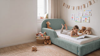
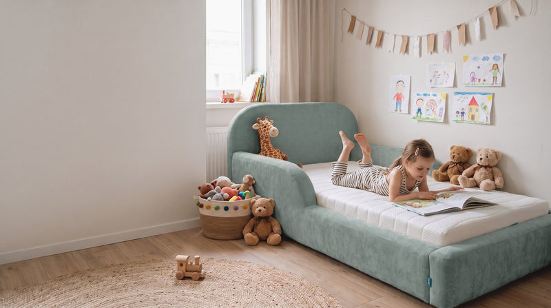
After the walls, the bed is the largest colour surface in the room, and with an upholstered bed that is doubly true, because it has no wooden surface but fabric all round. A bed in a loud colour can undo a carefully chosen wall colour; a bed in the same colour range as the wall makes the room look bigger and calmer. We deliberately kept the five colours of the Mila Cloud in exactly this muted family: sand beige, sage green, powder pink, mist grey and anthracite.
A few tried-and-tested combinations: sand beige with warm white walls and wooden furniture gives a very light, natural room. Sage green with cream or greige walls feels calm and grows effortlessly into the school years. Powder pink harmonises with warm grey and oak. Mist grey is the most neutral tone and goes with almost any light wall, including a softened blue. Anthracite sets a calm anchor in a light room and works well when walls and floor are very light; in a small, dark room a lighter tone is the better choice. The rule remains the same as for the walls: wall and bed calm, colour through bedding and cushions that you can change with the seasons.
Step by step: test a colour scheme over a weekend
- Observe the room: Note when daylight comes in and how bright it is in the evening without a lamp. North-facing rooms need warmer, lighter tones than south-facing ones.
- Choose two or three tones: All from the muted family, all light. Take tester pots instead of colour charts.
- Paint large swatches: At least 50 by 50 centimetres on two different walls, one of them opposite the window.
- Look at three times of day: In the morning, in the afternoon and in the evening under dimmed, warm white light. Only then decide.
- Hold textiles next to it: Lay duvet cover, curtain and rug next to the swatch; picture the bed in its colour alongside.
- Involve your child: Between two tones chosen by the parents, your child may choose. That creates ownership without neon orange winning.
- Paint and wait two weeks: Only then add pictures and accents. Often less decoration is needed than planned.
A colour that is neutral by day and warm in the evening will not need changing until the school years; the bedding may change, the wall does not.

Frequently asked questions about colours in the child's bedroom
Which colour helps sleep best in a child's bedroom?
There is no single best colour. Light, muted tones such as sand beige, sage green, softened light blue, powder pink or warm mist grey are low in stimulation and reflect enough light for the evening. More important than the colour family is that you choose a desaturated, light variant.
Is blue really calming for children?
A warm, muted grey-blue is usually felt to be calm; a cold, light blue can make a north-facing room feel frosty in winter. Blue light from screens in the evening is a different matter from blue wall paint; only the light demonstrably affects the body clock.
Can I paint the child's bedroom in two colours?
Yes, that is often the best solution. Three walls in a light base colour, the wall behind the head of the bed in a slightly richer, related tone. That gives the room character, and the child does not see the darker surface when lying down.
Which light suits muted colours?
Warm white light of 2700 to 3000 kelvin, dimmable if possible, and a dim, reddish or amber night light. Cool white light from 4000 kelvin makes even warm colours look clinical and has no place in a sleeping space.
How do I test a wall colour properly?
Use tester pots to paint swatches at least 50 by 50 centimetres on two walls, one of them opposite the window. Then look at them in the morning, in the afternoon and in the evening under warm artificial light, and hold bedding and curtain next to them. Only then decide.
Which bed colour goes with which wall colour?
It looks calmest when bed and wall are in the same muted colour range: sand beige with warm white, sage green with cream or greige, powder pink with warm grey, mist grey with almost any light wall. A dark bed such as anthracite works as a calm anchor in light, well-lit rooms.


